Overview
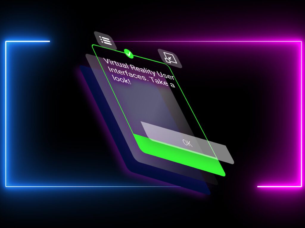
Based on an existing application on Virtual Reality, the user interfaces were outdated. A redesign was needed, not only visually but also in a interactive way.
Objective
Improve the visual aspects of the application in order to make it more appealing to potential buyers as well as enhance the user experience.
Users
Primary users are factory workers who use Virtual Reality applications as part of their training program. Potential users must also be considered.
Pain points
• User knowledge: disruptive technology and limited digital knowledge
• User experience: the way to interact with the virtual content
should be intuitive
• Virtual Reality context: other user factors must be considered
Process
User Experience
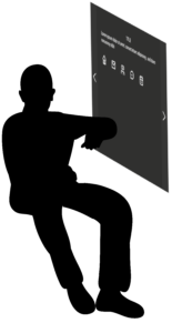
Wrist Watch Interaction
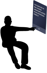
Touch Environment Interaction
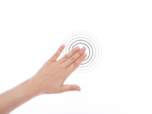
A new way of interaction was needed. To solve it we had brainstorming sessions. We came up with a new system where the button was integrated in the design. In this new system, the poster with the information no longer depends on holding your arm up. Instead, the poster is another element of the environment. and you can reach your hand to use it.


Button States - Interaction Feedback
User Interface
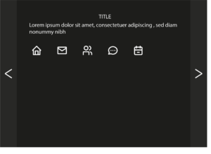
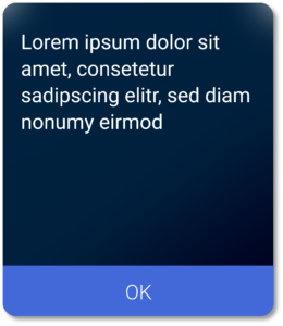
The design proposed, had a clear goal: improve usability by enabling a larger interactable area and reducing cognitive load. The intrinsic load was already heavy, as it is a VR App and involves learning. Because of this, the design removes any superfluous information or button and uses a simple font.
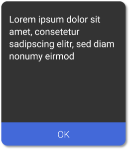
Proposals
Problems Considered
Human Interaction
Regarding User Experience, the usability was the main area to improve. This aspect was considered by adding a larger interactable area and mimmicking human behaviours.
Design Approach
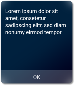
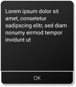
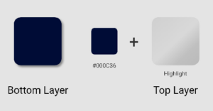
Finally, regarding User Interface design, the visual appealing was greatly improved. The colors used pretend to give some depth, as the component will be showed in a 3D environment.
Results
Unity Development Guide & UX Movement Improvement
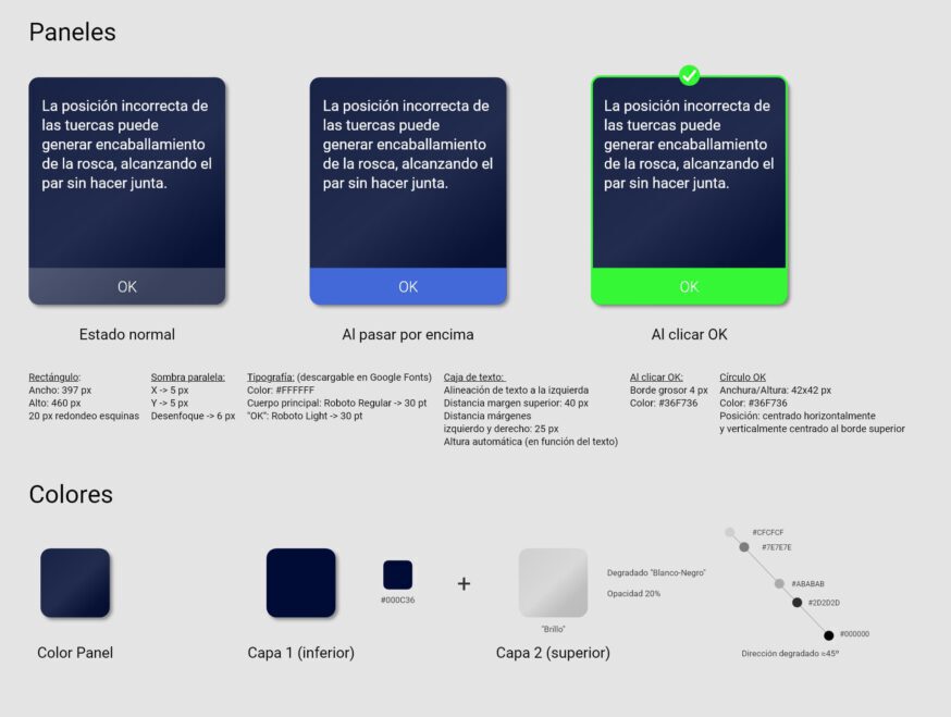
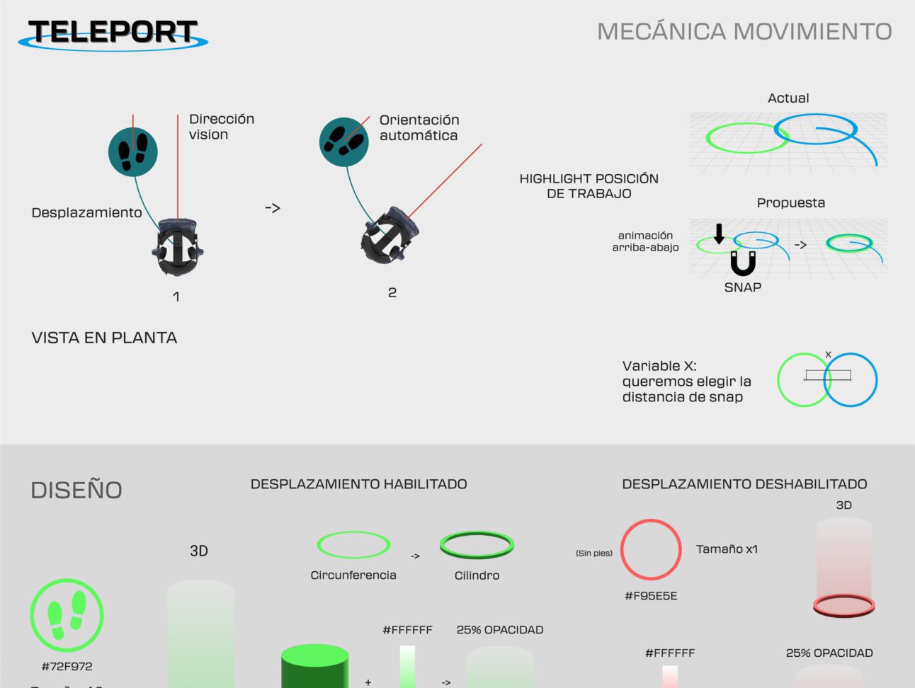
During users usage, I noticed they had trouble moving inside the virtual world. To solve it, I developed a guide to improve the perception of the environment.
Video of the application
Here you can see a quick example of the user interfaces. In the video you can see the interactive components and how they respond to the “touch”.
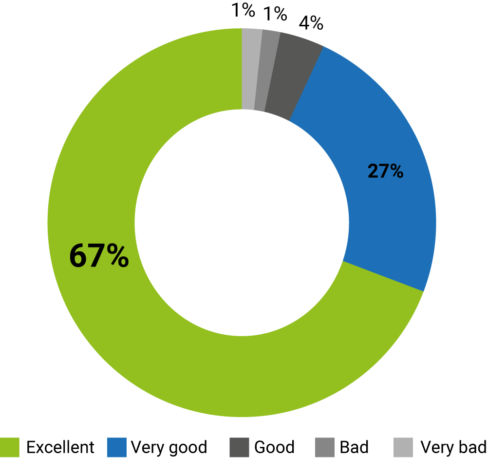
Survey Results
What do you think of the experience?
The new interaction system and button design was well received. In validation sessions, the feedback was quite positive.
This feedback was later reflected in the surveys. This survey was conducted to almost 100 people. Adding up “Excellent” and “Very good” results, a total of 94% of people think the experience was good overall.
