Overview
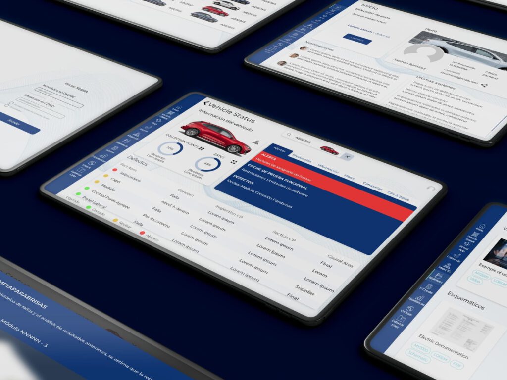
Kentron is a multiplatform web application, whose objective is to centralize all the information generated through the different systems that manage all types of data related to a vehicle.
Objective
Create a system where users have everything they need to do their job. In this way, the process is optimized and satisfaction is improved.
Users
Primary users are repairmen, quality inspectors and team leaders who work in an industrial environment.
Pain points
• Each department has developed its own software
• Different applications could be used for the same task
• The data is located in differents servers and websites
Process
Brand Conceptualization
Brand Ideas
Digital Sketch
Logo Proposals
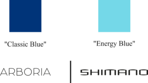
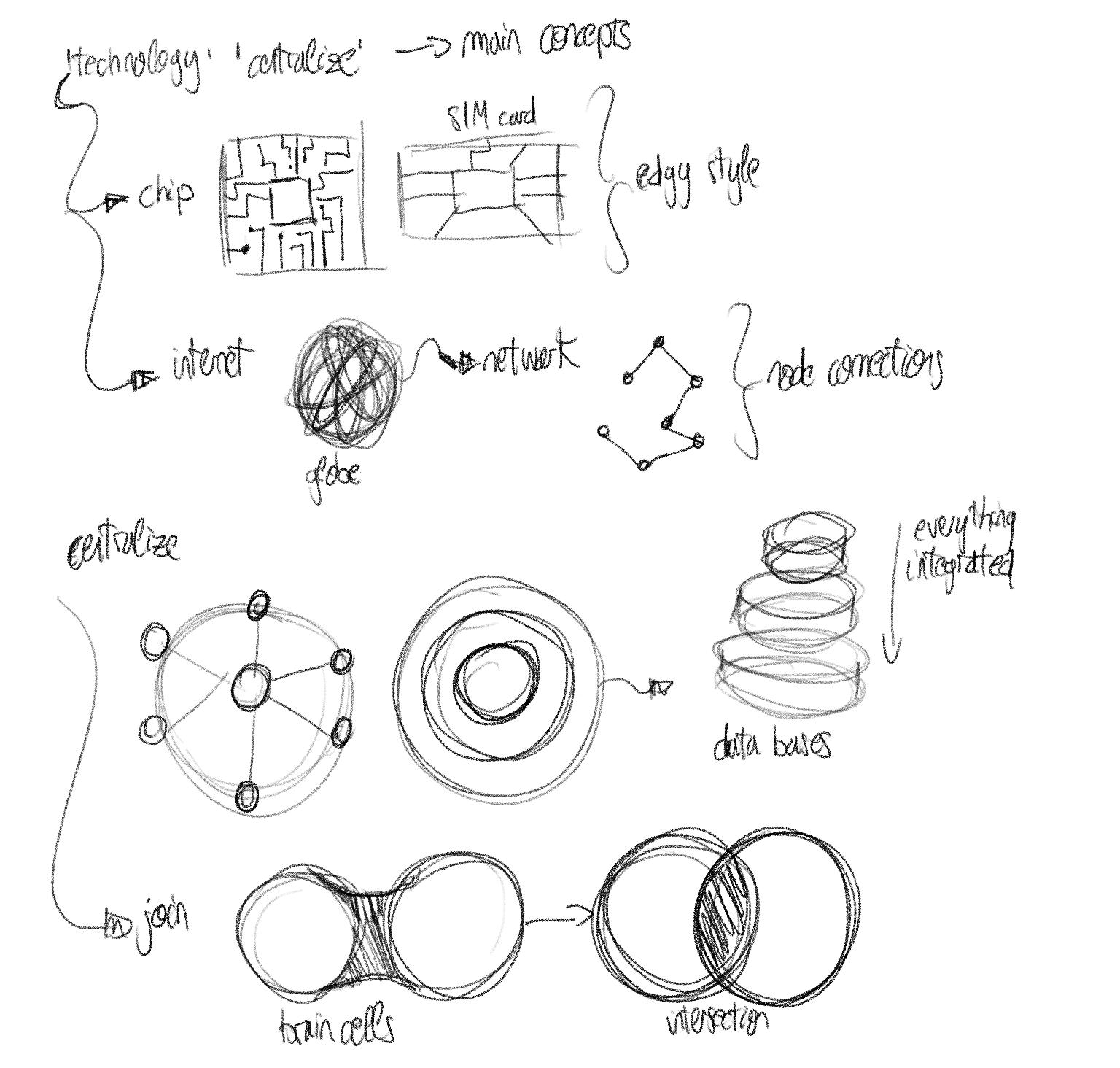
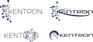
As part of my creative process, I began sketching based on some key terms handed me in the briefing. In that briefing, it was stated that the base color had to be blue.
User Navigation & Wireframes
During the project, I was the sole UI/UX Designer. As part of my internship, I participated in meetings with developers, product owners and senior engineers. In these meetings, we decided that these was going to be the initial User Navigation.
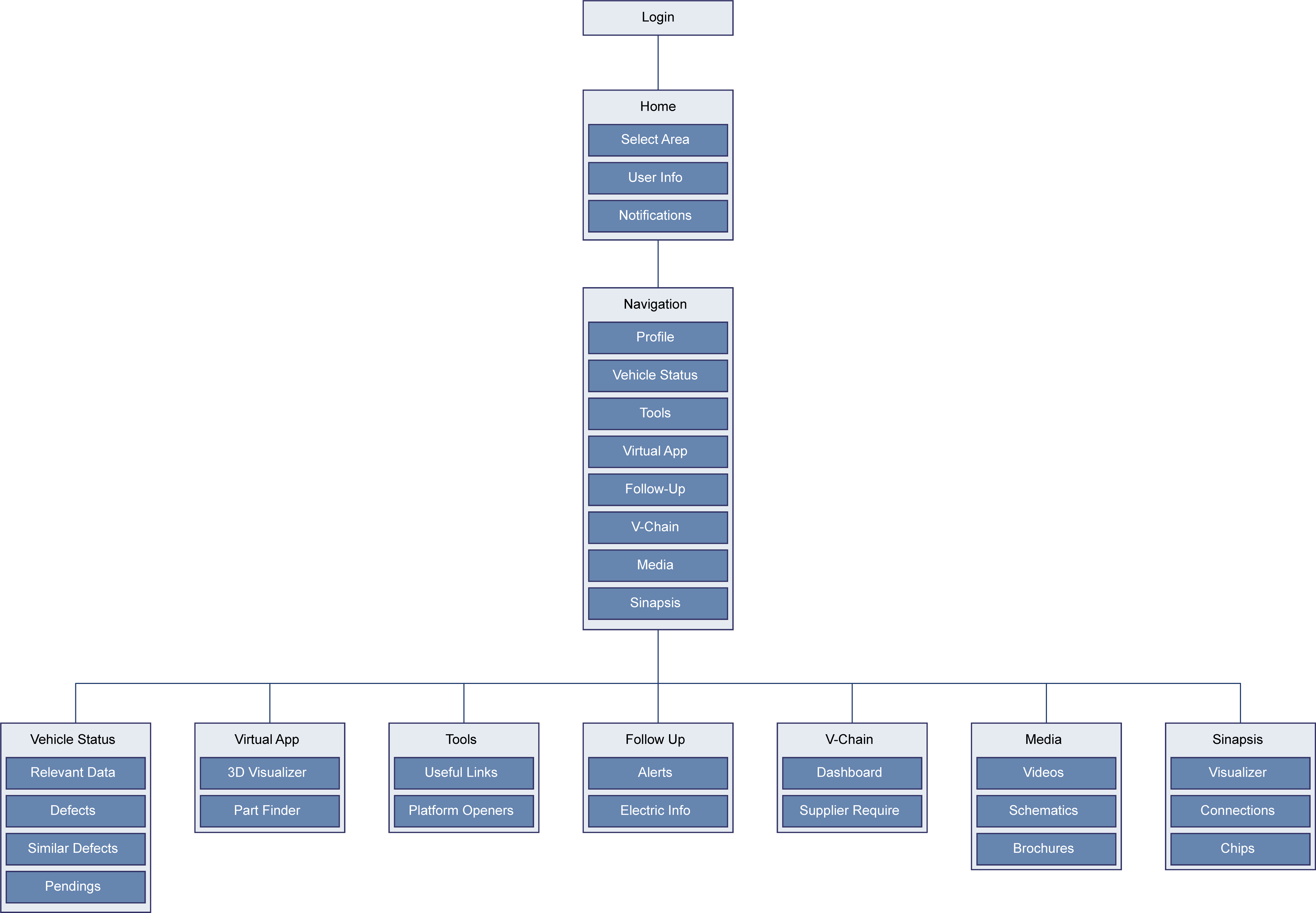
During the project, I was the sole UI/UX Designer. As part of my internship, I participated in meetings with developers, product owners and senior engineers. In these meetings, we decided that these was going to be the initial User Navigation.
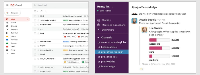
Left-side Navigation Research - NNG
As part of the main goal of the project, all of the different platforms must be displayed in a intuitive way. In this regard, I researched about Interaction Cost and Scannable Navigation in some sources like Nielsen Norman Group. Because of this, I decided to make a left-side navigation menu.
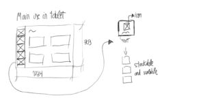
Problems Considered
Brand Integration
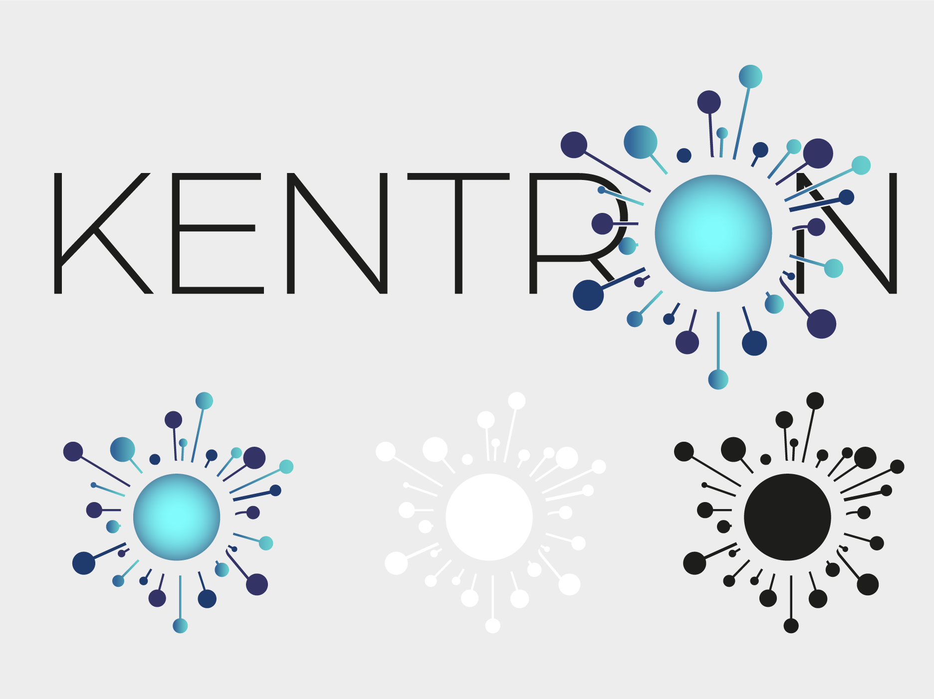
Given the briefing, the brand identity meets with users requirements. It is recognisable as part of the company but also maintaining its own personality.


Left-side Bar Navigation Menu
Finally, as part of user-centered approach, the main pain point was considered: facilitate navigation and therefore the use of the different tools.
This first approach aims to help the transition until there is no need for external platforms: once the users are used to Kentron, the developers will include all the tools native in the application.
Results
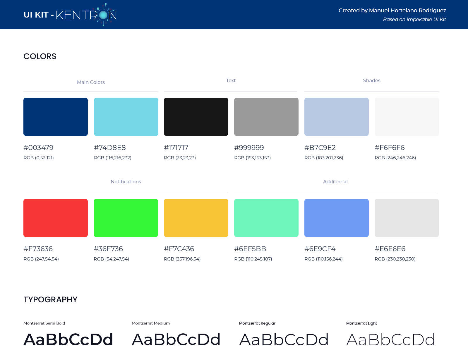
User Interface Guide & Brand
High Fidelity Prototype
Users Feedback
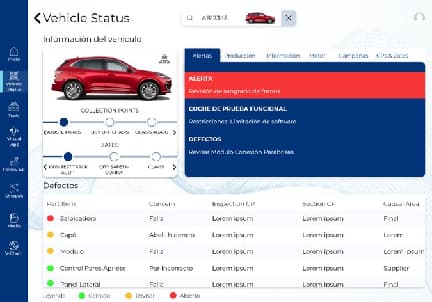
Before

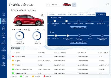
After
Swapping over that little area was frustating and the navigation was uncertain. These feedbacks were collected in one to one interviews. To fix it, the new design has the whole right tab to swap including buttons to the first, the last and the current station.
