Overview
E-BEAT was born as a project carried out between several companies. It is a consortium whose objective is to integrate and develop advanced tools in production processes.
Objective
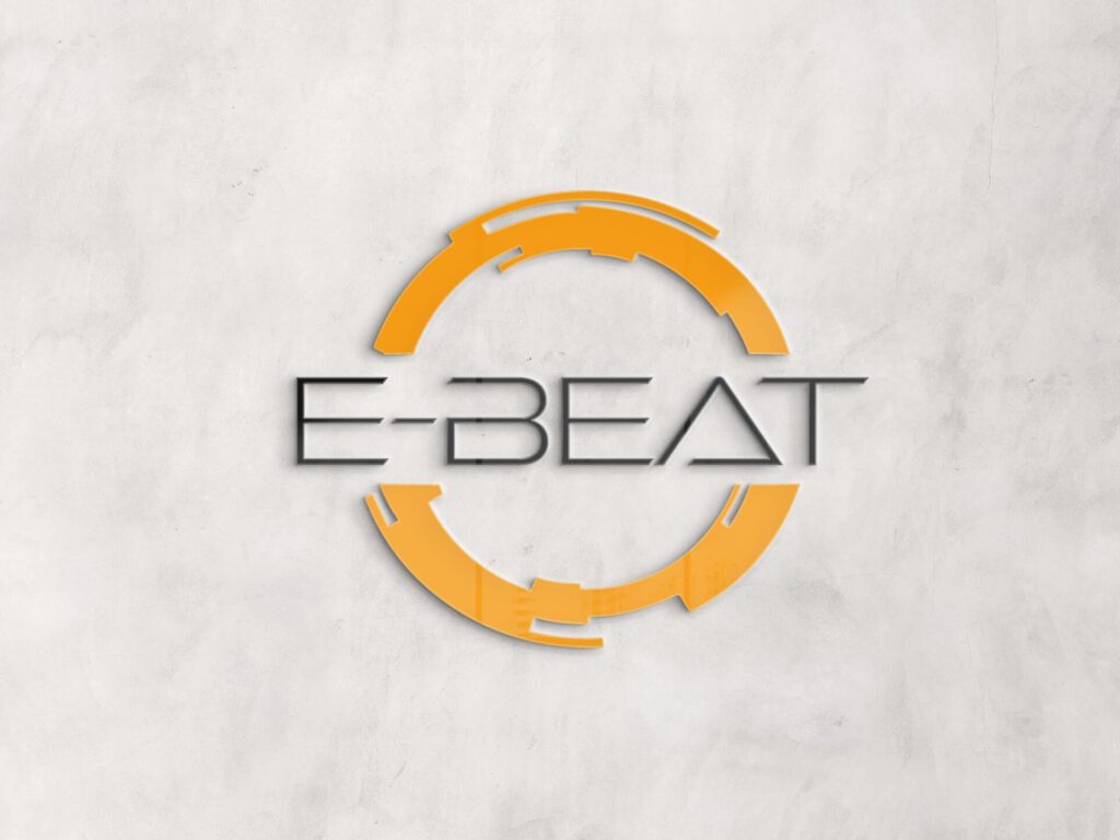
Create an identity brand where all companies can be represented equally as part of the same project.
Users
All the companies included in the consortium, mainly software and automotive engineers.
Pain points
The identity of the project must be independent of the companies. From a designer perspective, it is challenging to not be influenced by any design aspect of a group of companies.
Process
Brand Conceptualization

To approach this project, I was given a presentation which included all the activities and the roles the companies had. Unfortunately, I can’t give any detail of these activities. However, I can tell you an aspect that they all shared: cutting edge technology. In my mind all of it sounded like the future is now.
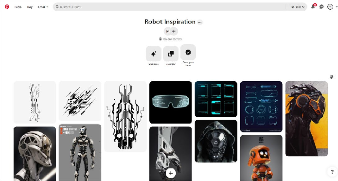
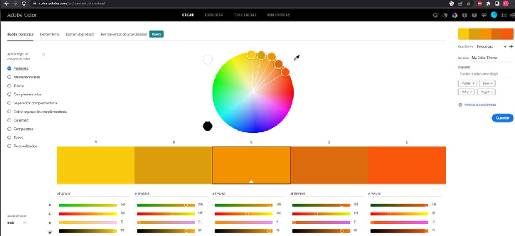
Because of this, all I could think of was “Robots”. Robots involve technology and represent the future. The main color choice was decided based on what I wanted to convey: modernity and vitality. This choice was reinforced by the fact that no company included in the consortium uses that color.
Resources Used
Adobe Colors Tool - Color Exploration
Design Considerations
Due to the competitive work environment (VUCA) where this project was developed, the time given to develop it was tight. Because of this, I used some tools to boost my productivity such as Adobe colors and moodboards for quick concepts.
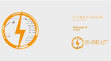
Finally, the proposal chosen was the last one since it represents the compromise between simplicity and strong personality.

1 week
Results
Brief Branding

Presentation Template

Personal Learning
During this project, I had the chance to develop a brand identity in a tight timeline and and in an unusual context. It is also worth mentioning that I was an intern at the time.
As part of the challenge, my communication skills were tested as I had to present it to the engineering leader of the consortium. I had to explain that the color orange is intended to convey innovation, vitality and creativity. Also, I had to explain that the geometry of the logo and the font is intended to convey futurism.

Bonus Parts
Informative Panel
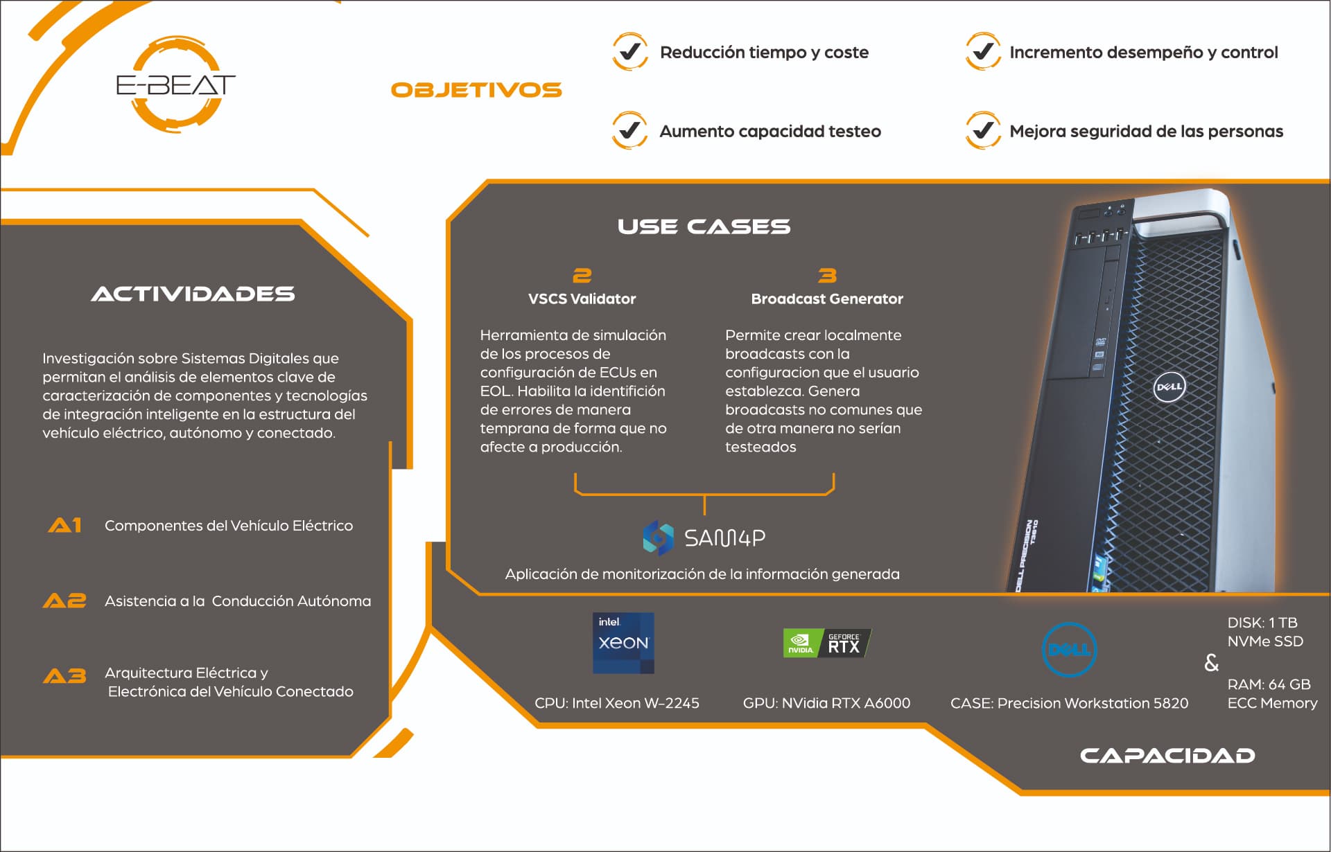
This first bonus part is a poster. The aim was to demonstrate what the equipment was able to do. It represents in a visual way the performance of the computer as well as the activities that it takes care of.
PC Modding
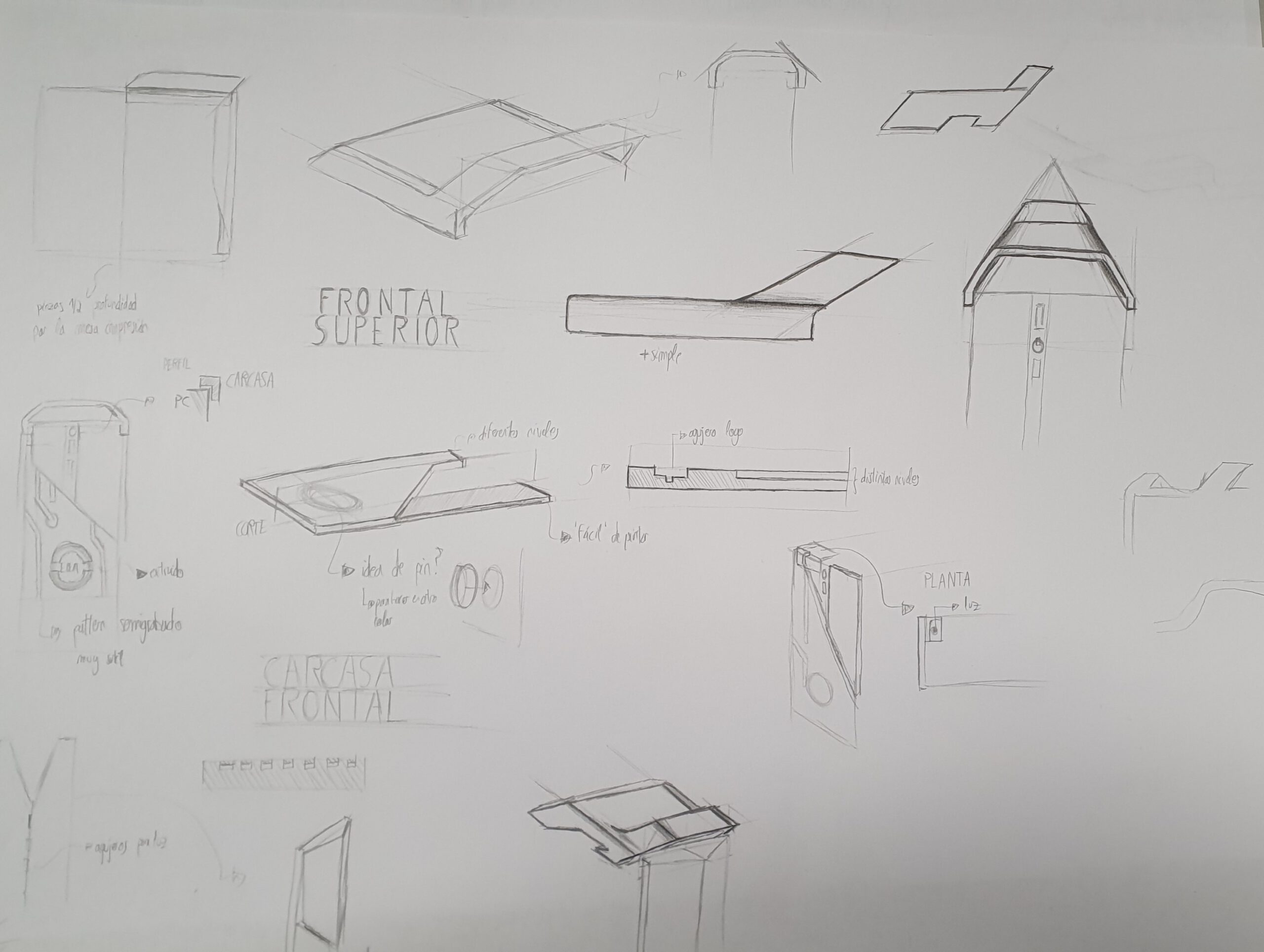
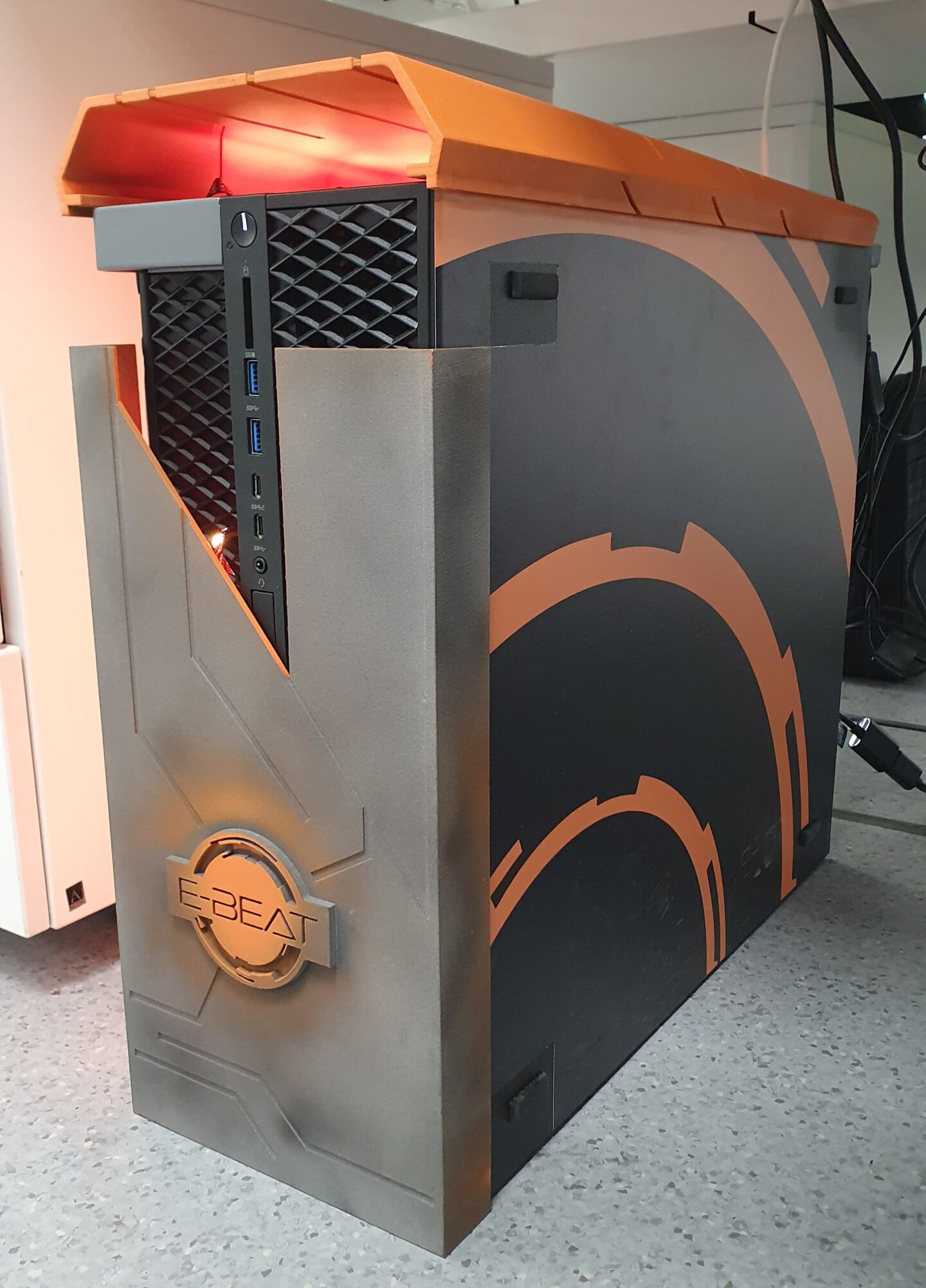
This bonus part is some kind of PC Modding. As a background in industrial design, I sketeched some solutions, I used CAD Inventor to create the files to 3D print. I also designed the lateral vynils that I later sticked. Finally we added the fanciest part in a PC modding: LED lights!
Digital Product Logo
As part of the same project, the team developed a digital tool. I will not explain this tool as it isn’t the goal of this part (and I wouldn’t know how to do so) but, again, the project needed some identity. The software is a validator that prevents errors from ocurring.
The branding proposed uses the same visual style. Regarding the logo, I thought of a name duality; Checker because of validation but also because of the strategy game. In every strategy game it is crucial to anticipate to the rival move. Despite not being in a checker match, anticipate to potential errors that can critically affect to the manufacturing process is also exciting! Here you can see the result:
